Pictorial displays
Pictorial displays are among the most important techniques that help you describing and analyzing your data. The R graphics system is very powerful and lets you produce professional-looking graphics. There are high-level plotting functions that are best suited for simple graphs, while low-level functions provide you with advanced tools to edit details and add annotations.
These examples are based on the high-level plotting functions. Most of
the times getting the right result is a matter of playing with some of
the many graphical parameters. General graphical options are handled by
the par() function, while each specific function has its own
parameters.
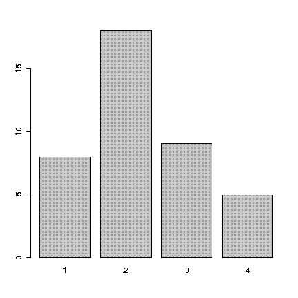
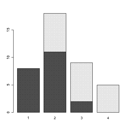
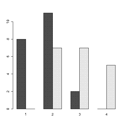
Barcharts
Barcharts are good if you have to depict a non-numeric variable, such as nominal and ordinal variables. Bars in the graph are physically separated meaning that this is not a cartesian graph.
> barplot(table(Cond))
> barplot(table(Mat,Cond), beside=FALSE)
> barplot(table(Mat,Cond), beside=TRUE)
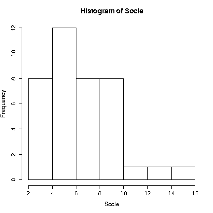
Histograms
Histograms are as much different from barcharts as ratio variables differ from nominal. An histogram represents the density distribution of values on a continuous axis.
> hist(Socle, freq=TRUE)
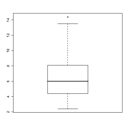
Boxplots
These are known also as "box-and-whisker plots", because of their shape. Boxplots are useful to compare visually the same variable in different datasets because they provide a quick way to represent the most common measures of position (mean, quartiles, outliers).
> boxplot(Socle)
In this graph the central line in the box represents the average mean value, the alone point is an outlier.
Stem-and-leaf plots
Stem-and-leaf plots are useful if you need not only to represent the distribution of your variable, but also to keep your original data available without losing too much space.
> stem(Socle)

  The decimal point is at the |

   2 | 40114455
   4 | 23556812489
   6 | 01466258
   8 | 011466726
  10 | 2
  12 | 5
  14 | 4
> stem(Socle, scale=2)

  The decimal point is at the |

   2 | 4
   3 | 0114455
   4 | 235568
   5 | 12489
   6 | 01466
   7 | 258
   8 | 0114667
   9 | 26
  10 | 2
  11 |
  12 |
  13 | 5
  14 | 4
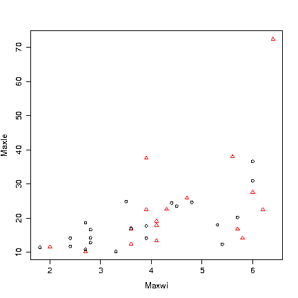
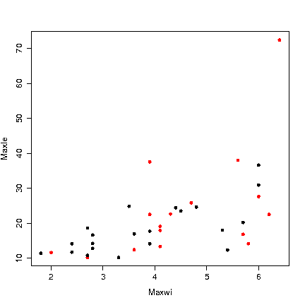
Scatterplots
Scatterplots are a mean to compare one variable against another, plotting on a cartesian surface. The values of one variable are used as X values, and the other’s as Y values.
> plot(Maxwi,Maxle, col=Mat, pch=19)
> plot(Maxwi,Maxle, col=Mat, pch=Mat)