Contingency Tables
A contingency is obtained when by crossing two qualitatives nominal variables, typically artifacts type and archaeological assemblage.
Let's assume we have a data.frame object named MyData. Each line
corresponds to an artifact. The first column contains a label, the
second the assemblage and the last the artifact type :
label     assemblage  type
CLXIV-001   CL XIV 5+6  t
CLXIV-002   CL XIV 3+4  plh
...     ...     ...
R provides two functions for computing contingency table, here assemblage against type:
MyCrossTable <- table(MyData[,2], MyData[,3])
an alternative :
MyCrossTable2 <- xtabs(~., NMB_2006[,c(1,6)] )
The latter can be used as argument to the corresp() function from the
MASS package which computes correspondence analysis, a factorial data
reduction method suitable for contingency tables.
Frequency Tables
The prop.table() function calculates the frequency table
(percentages). Its first argument is an objet of class table. The second
is the margin : 1 for row, 2 for columns.
MyCrosFreq <- prop.table(MyCrossTable, 1)
Here is an example :
     TYPE_REC_
PHASE     type 1    type 2    type 3    type 4
    1 0.29242348 0.2506487 0.1904153 0.2665125
    2 0.44952914 0.2752219 0.1045417 0.1707073
    3 0.00000000 0.5199755 0.1823170 0.2977075
    4 0.13439854 0.5759938 0.1875329 0.1020748
    5 0.07930212 0.1942093 0.1844235 0.5420651
    6 0.14209591 0.2609925 0.1652278 0.4316838
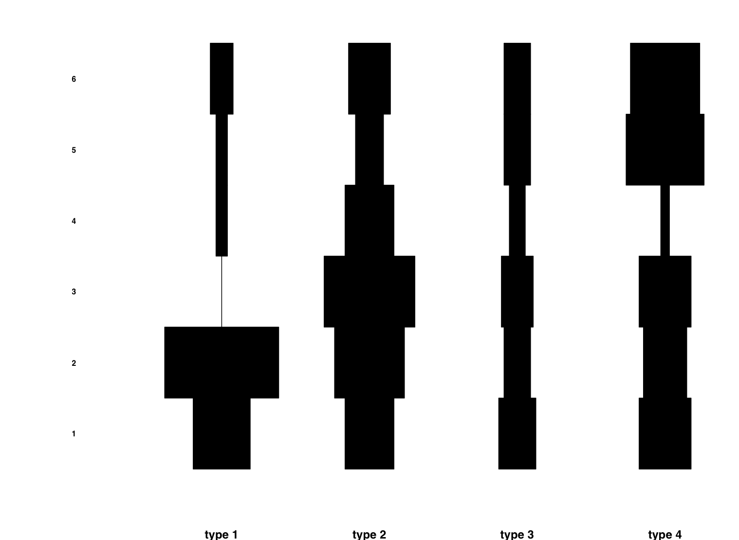
Plotting
Now we can plot our frequency table. A graphical representation allows us to have a feel of the trends, even if there are many artifacts types and assemblages.
A common and popular way to represent a frequency table is Ford's Battleship diagram. Is is derived from the barplot.
Here is a code that implements it1:
ford <- function(x, cex.row.labels=1) {
#################################################
##  FORD'S "BATTLESHIP" DIAGRAM                ##
##  Loic JAMMET-REYNAL, may 2006               ##
##  Departement d'Anthropologie et d'Ecologie  ##
##  University of Geneva                       ##
##  jammetr1[at]etu.unige.ch                   ##
#################################################

    dim(x)[2] -> jmax # colonnes j
    dim(x)[1] -> imax # lignes i

    set.up <- function(xlim, ylim) {
        # setting up coord. system
        plot(    xlim,    # x
                ylim,     # y
                type="n", # no plotting
                axes = FALSE,
                asp = NA,
                xlab = "",
                ylab = "")
    }

    ## initialisation du device
    ## on divise par le nombre de colonnes + 1
    ## 1ere colonne : labels
    op <- par(mfrow=c(1, jmax+1), mar=c(5,0,2,0))

    # labels des lignes (colonne 1)
    set.up(c(0,1),             # x
           c(0.9, imax+1.10) ) # y

    for (i in 1:imax) {
        text(0.5,
               i+0.5,
              row.names(x)[i],
              font = 2, # boldface
              cex = cex.row.labels)
    }

    for (j in 1:jmax) { # colonnes j
        set.up(xlim = c(-60,60)*max(x),   # x
               ylim = c(0.9, imax+1.10) ) # y

        title(sub=colnames(x)[j],
              font.sub=2, # boldface
              cex.sub = 1.5)

        for (i in 1: imax) { # lignes i
            # le plus important. boite multipliee
            # par les parametres
            X <- c(-50,+50,+50,-50,-50)*x[i,j]
            Y <- c(i,i,i+1,i+1,i)
            polygon(X,
                    Y,
                    xpd=FALSE,
                    col="black",
                    mar=c(0,0,0,0) )
        }
    }
}
You first have to run the above code. A new function called ford()
will be available. Its argument is a frequency table.
In order to represent a chronological hypothesis, you have to rearrange the order of rows and columns. A way to do it is giving two a vector of indices between brackets right after the frequency table object:
ford(MyCrosFreq[c(1,2,4,3), c(2,4,5,3,1,6)])
You can obtain optimal ordering by use of seriation techniques.
This is an output example :
-
Jammet-Reynal, L. (2006).- La céramique de Clairvaux VII (Jura, France) : typologie, étude quantitative et sériation. Genève : Département d'anthropologie et d'écologie de l'Université. Unpublished Master thesis. ↩